Extract from the Human Rights Commission website: © Australian Human Rights Commission
ISSUE 10:
Signage required by the
Building Code of Australia (BCA)
Importance of the feature
Most of us benefit from the availability of good and clear signage. This is particularly so for people with a vision and/or hearing impairment, people with a cognitive and/or intellectual disability and people with a brain injury. Many of the signs we find around the built environment are not easy to comprehend due to their location, type of font styles used and the colours chosen.
Lack of raised tactile and Braille in signs require people with a vision impairment to rely on others to assist them.
Many people with cognitive disabilities are less able to comprehend a sign if it is all in upper case, however if the sign is in sentence case with upper and lower case, the accessibility of signs is improved.
Nine out of ten legally blind people have some usable residual vision; it is this group plus those with low vision that particularly benefit from the correct use of luminance contrast and the use of a sans serif font style such as Arial or Helvetica medium. This also makes the signs more user friendly for the remainder of our community, especially those 1 in 10 males in Australia who have a colour deficiency, often referred to as colour blindness.
The location of signs is vital if they are to be easily identified and read, particularly signs indicating facilities for people with disabilities.
Code requirements
Signage requirements in the Building Code of Australia (BCA) in D3.6 are limited to the identification of accessible facilities, services and features. D3.6 refers to and requires compliance with relevant parts of AS1428.1.
AS 1428.1 specifies technical details such as dimensioning, and design criteria of the signage and symbols to be used.
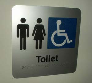
Photo 1
Photo 1 shows clear signage for toilets
AS1428.1 provides information on the international symbol for disability access and deafness along with their design criteria and colours to be used. These signs are used to indicate where an accessible facility has been provided.
In addition to D3.6 there is another section titled Specification D3.6 which sets out the parameters in good sign design and covers issues such as placement heights, font types, use of raised tactile and Braille, luminance contrast requirements of lettering and lighting requirements.
Even though the BCA has limited application to required signage if a building owner wishes to improve other signage to assist everyone who uses the building (such as other wayfinding signage, building occupant directories and room names) the good design parameters set out in Specification D3.6 should be applied to the other signs as far as possible.
Achieving best results
To be effective signs must be within the design criteria set out in BCA specification D3.6 and AS1428.1.
This is achieved by ensuring:
- Mounted within the required height range.
- Use of raised tactile and Braille on signs identifying facilities for people with disabilities.
- Correct use of luminance contrast and font size and type.
- Good provision of lighting without glare.
Common problems and misinterpretations
1. Font styles and symbols used
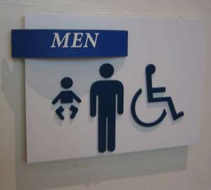
Photo 2
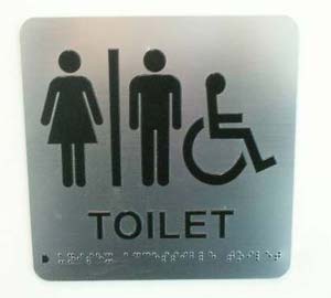
Photo 3
Photo 4
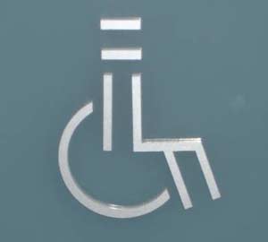
Photo 5
The signs in photos 2, 3 and 4 have all used incorrect fonts. The sign in photo 2 has used a serif type font and in upper case, which can make it difficult for people with a vision impairment to understand the sign due to the varying thicknesses in the font.
The signs in photos 3 and 4 have also used all upper case instead of sentence case, which can create an access problem for people with cognitive disabilities who may have difficulty comprehending what the signs are telling them.
The international symbols for disability used in photos 2 and 3 do not meet the requirements of the standard as the symbol must always be white on a blue background, which makes it instantly recognizable.
Photo 5 shows a stylized version which may be quite unrecognizable by many people with cognitive or intellectual disabilities.
The sign in photo 3 has a line between the male and female figures, which indicates a separate accessible facility for each gender. Accessible facilities must always be non-gender specific to enable a male occupant and their female carer or assistant (or visa versa) to enter an accessible facility through a non specific gender area.
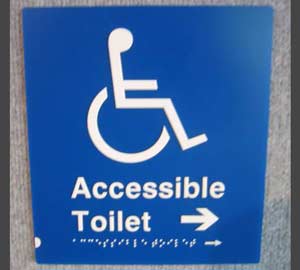
Photo 6
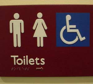
Photo 7
Both signs in photos 6 and 7 have used the correct symbol and colours for disability and required font styles along with the Braille. Note: the arrow on the sign has been repeated in the Braille section of the signs.
Photo 7 shows the correct symbols to be used identifying a unisex accessible facility without a dividing line between the male and female figures.
2. Location of signs
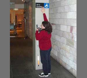
Photo 8
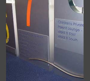
Photo 9
The sign in photo 8 is definitely too high being outside the 1200mm to 1600mm range above the finished floor level required by AS 1428.1. People in a seated position in a wheelchair may not be able to tilt their head back on an angle to read a sign higher than 1600mm above the finished floor level due to their disability.
The sign in photo 9 is definitely too low as it would not be possible for a person to read the Braille unless they were laying on the ground.
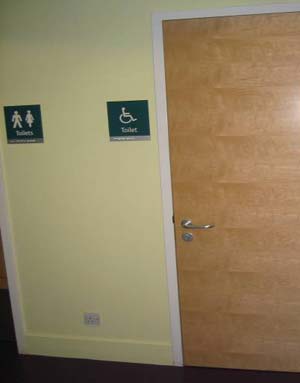
Photo 10
The sign in photo 10 is within the correct height range, which allows it to be read in relative comfort by all members of the community.